EDA
EDA
We have selected a few key charts that provide an overview of the key findings from the EDA (Exploratory Data Analysis).
Fig 1: Completed Loans
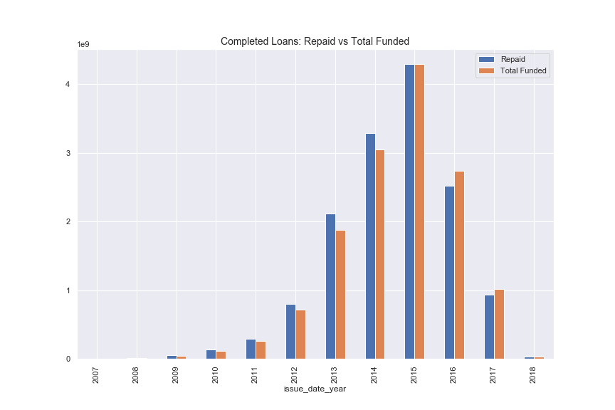
Figure 1 shows the overall growth rate in loans. Note that loans are typically provided for terms of 36 or 60 months. As only completed loans are shown in Figure 1 the reduction in overall volumes since 2015 is simply due to the fact that the current loans are excluded. Note that the values of the y-axis are in billions of dollars. We can therefore clearly see that from its start in 2007 until 2015 LendingClub grew from nothing to over 4B$ in completed loans an impressive feat for a start-up.
Fig 2: APY Distribution
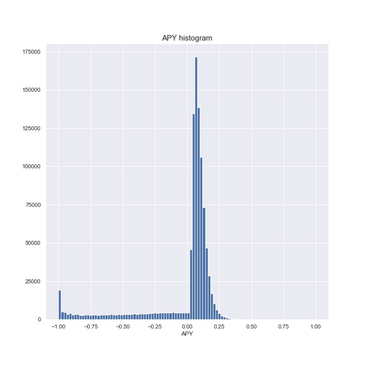
Figure 2 shows the distribution of the Annual Percentage Yield. As already mentioned the curve has a long left tail of loss making loans. In our data cleansing we excluded loans which had a yield of less than 100% (this is possible by annualising a 100% loss which takes place in less than 1 year). The mode of the APY sits at 6%.
Fig 3: APY Distribution by Year
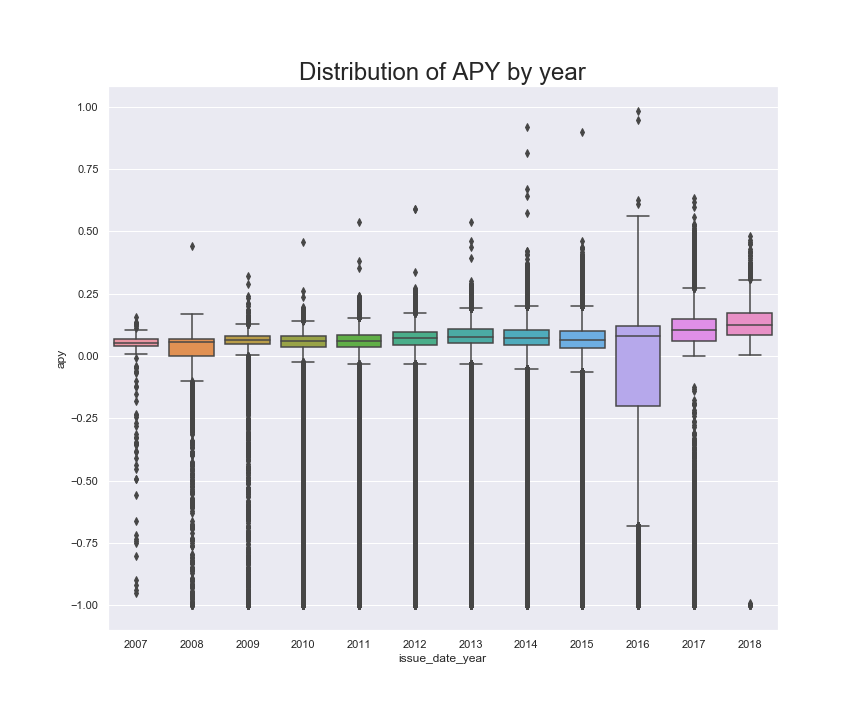
Figure 3 shows APY by Year. The data from 2007 until 2015 is similar and it is therefore reasonable to draw conculsions regarding the distribution of APY for these years. However, for 2016 the data will have an outsized portion of defaulting loans since they are logged as “completed” whereas the current loans which are profitable are not yet in the data set. The APY mean from 2007 until 2015 has always been positive but with very broad distributions.
Fig 4: Profitability by LendingClub Credit Score
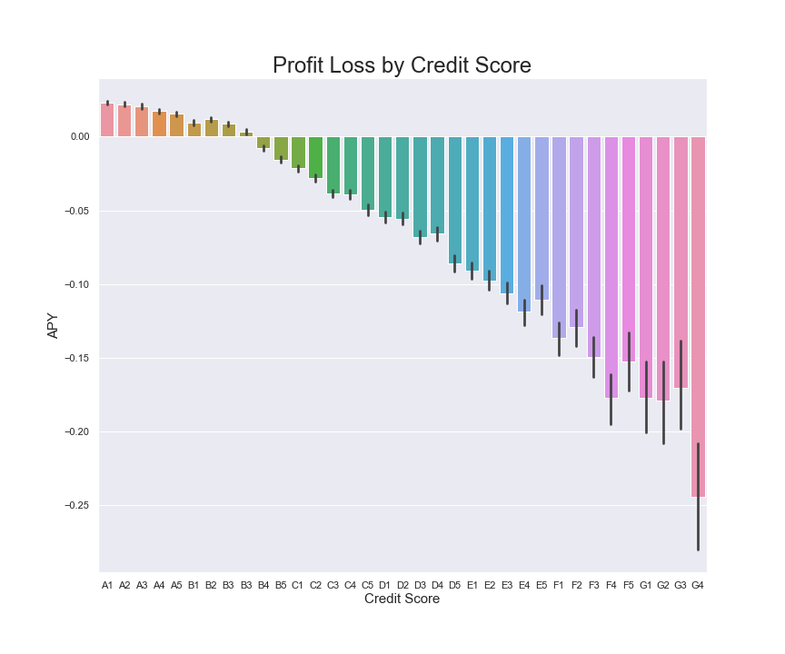
Figure 4 shows the profitability of loans in accordance with LendingClub’s own credit scoring. The graph clearly shows that only the best credit scores generate positive average returns despite the fact that their gross interest rate is much lower. This then, represents the “simple” method for earning a positive return on a LendingClub portfolio: only invest in those borrowers who LendingClub has ranked from A1 to A5. These investments will earn less than 2.5% net.
Fig 5: Correlation of Predictors
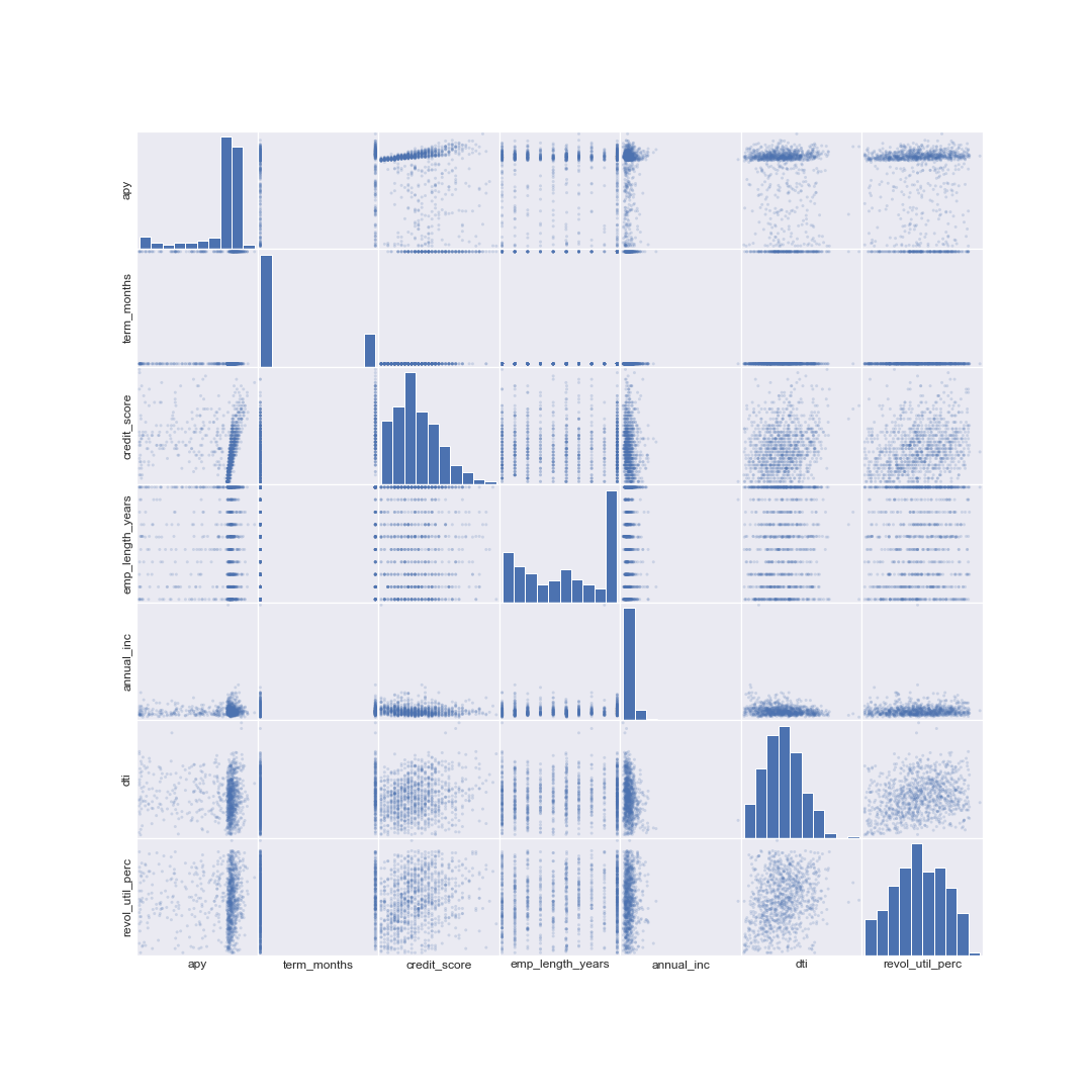
Figure 5 provides an overview of some of the most important credit score predictors. There are no clear relations other than the mechanical ones like credit score and APY for those borrowers who repaid their loans.
Discriminatory Behaviour
Studies show that discrimination against African American and Latino burroughs is a large problem.
Reveal News published an article concerning discrimination in lending in <”https://www.revealnews.org/article/for-people-of-color-banks-are-shutting-the-door-to-homeownership”> . This article cites a study showing lending discrimination even when controlling for the usual factors such as income, credit history, etc. Banks achieve this primarily through geographic discrimination.
Although the data presented to Lending Club borrowers does not include any racially identifiable data, it does contain information that is molded by the borrower's race. For example, people in one area may be far more likely to be white than in another area that is more diverse. Thus, looking at the state or zip code could give investors a preliminary indication of the likelihood that the borrower is white.
The Reveal News article goes on to explain that lenders often cite confidential factors that make up a person's credit profile. Lenders say that minority borrowers tend to have lower credit profiles and thus are less likely to get loans. However, these credit profile factors (such as credit score, salary, payment history) are themselves influence by a person's race. Thus, even if only indirectly, race plays a role in lending.
In our project, we attempted to collect demographic information by state and zip code but were unable to analyze how our models discriminated against minorities. If we had more time, the results of our model would have been compared with the information presented to see if the models picked more loans in white-majority areas. However, this would not have proven any real discrimination, but would be suggestive of more investigation.
Another possible area of concern is self-discrimination, where potential minority candidates simply do not apply for loans out of concerns that they will be denied. Or for example, perhaps Lending Club does not market to minorities and thus they may not know that they could apply. In either case, without having information about the borrower's race, it's impossible to determine this. However, perhaps some surveys of past borrowers might yield some helpful information. It would be interesting to know the racial makeup of borrowers.
It is worth noting the recent and ongoing litigation cases against Lending Club which, in our view, raise concerns about whether this company is improving the fairness of lending. In Q1 2018 Lending Club settled a class action suit that had been brought against them by their own shareholders. They settled for a total of 125M$. Of this total, 77.3M$ is to be paid directly by the company and the remainder will be covered by insurance. The basis of the lawsuit was that Lending Club had, falsified the data related to certain loans and that this had inflated the value of the stock price.
There is another current class action lawsuit against Lending Club from borrowers who are claiming that LendingClub essentially extracted far more in fees than had been agreed. Certainly, the fact that fees paid by borrowers are about 4 times the fees paid by investors is not well disclosed on their website.
Fig 6: Proportion of Non-White Population by State

Figure 6 provides the non-White population per State for the whole of the continental U.S. as well as Hawaii and Alaksa. The states with the higher non-white populations are Mississippi, South Carolina, Hawaii and Alaska. Our intention here was to correlate this data with demographic data from the LendingClub to see if there was any preliminary evidence of discrimination.
Fig 7: Proportion of Bad Loans by State
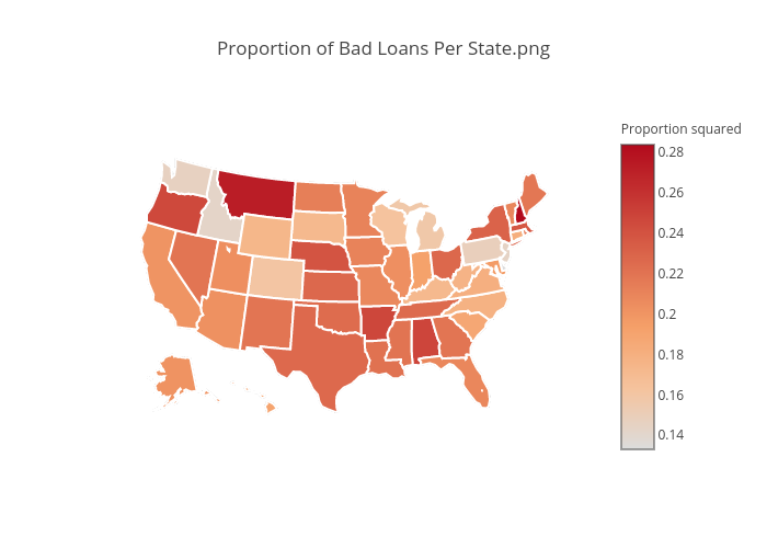
Figure 7 takes this one step further by assessing the bad loans per state for all credit within the U.S. Note that this is LendingClub data.
Fig 8: Funded Loans per Capital by State
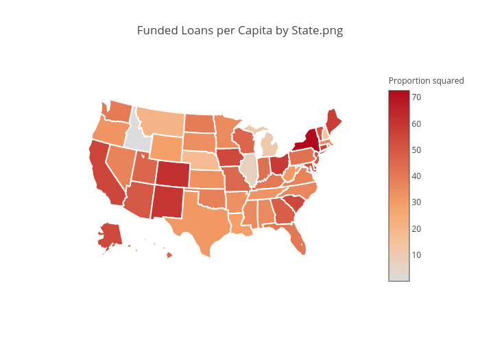
Finally, Figure 8 gives us loans per capita by State. Figures 6,7 and 8 give us a pretty good geographical picture or how LendingClub loans correlate by state and the concentration of the non-white population by state.
Fig 9: Mean APY by State (LendingClub)
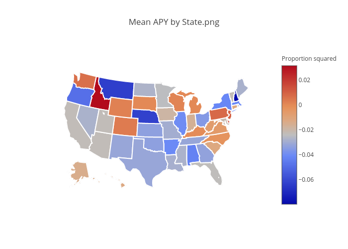
Figure 9 introduces profitability data into the geographic equation.
It is not possible to draw accurate or even preliminary conclusions from this limited geographic data. If we had had access to additional demographic information then we would have tried to replicated the methodogy that was outlined in the Reveal paper. One particularly difficult issue would have been trying to work out whether the fact that LendingClub is online is a factor in predicting the racial make-up of their clientele. Similarly, it may be that non-white borrowers are more open to borrowing on-line than whites as their access to capital from traditional sources is more limited.